Top Ten Tuesday is hosted over at the other blog I write for, The Broke and the Bookish.
I’m a firm believer in the power of an awesome book cover. While we all wish we could place ourselves in the category of those who do not judge books by their covers, we all do it. It might not make us decide whether or not to read a book, but it almost always creates a feeling within that you expect the novel to have. Sometimes this just does not happen. And sometimes… it’s just ugly. Here are the top ten book covers I wish I could redesign.

Vampire Academy by Richelle Meade
She just has this really weird look one her face… and the shadow over her other eye is just weird. *shrug*

Don’t Turn Around by Michelle Gagnon
It’s just creepy. And the hand looks weird.

It’s not just this one. I want to redesign all book covers that are just a pretty face and nothing else. Where is the creativity?

It looks like it’s trying to be Divergent.

Phoenix Overture by Jodi Meadows
I really, really wish the designers had not decided to give Sam a face. I liked dreaming him up in my own mind, and he looks nothing like this guy. It kind of ruined it for me, and I have been lacking the motivation to read it.

The Fault in Our Stars by John Green
Will someone please tell me why this cover is a good one? It’s boring, and I don’t like how Jodi’s quote is meant to be a part of the design along with John’s prestige-ness.

Delirium Stories by Lauren Oliver
It looks like a bunch of clip art flowers haphazardly stuck together. Not good.

Sloppy Firsts by Megan McCafferty
The focus is on the legs. Why? I hear so many amazing things bout this series, that the cover of the first one should probably be nice.

I really like the typography, but the girl looks creepy and the dress is really ugly.
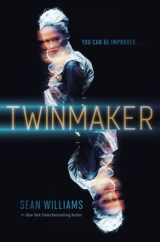
This cover is just not attractive, and I’m not a fan of the font.
So, how do you feel about these covers? Agree? Disagree? Which ones did you pick?
I totally agree about Vampire Academy! That one made my list. And the Jessica Darling series is SO good, but those covers don’t do it any justice. It doesn’t capture what those books are about AT ALL!! I like that TFIOS is totally recognizable. I could be on the other side of a football field and know that someone was holding that book. BUT year I don’t really understand it and I don’t like the whole “New York Times Bestseller” being part of the design. I don’t think I’ve ever see that kind of stuff incorporated like that. Weird.
My TTT
I agree with the VA series, and will go one step farther, to add the Bloodline series. If I wasn’t a fan of the writing, I don’t think I could own these books. I hate the covers so much. Then it got weirder with Bloodlines. I tired of the cover models.
I nearly put that Vampire Academy cover on my list. I’m not keen on it at all. Great choices.
YES. Vampire Academy needs a makeover! (That series + Bloodlines!) Every time I look at this cover, I keep going “what is Angelina Jolie doing here?”
Before knowing the hype of the Megan McCafferty books, I was turned off my the covers. The series deserve better covers.
I agree with you on the one about The Fault in our Stars. Honestly, I’ve seen much better fan-arts on Tumblr. Have you seen the black cover? It’s the Australian, I believe. What I would do to grab a copy of that!
I so agree about the InHuman cover. It looks way to much like the Divergent cover to just be a coincidence.
I have also seen the Vampire Academy books on a few lists today.
Check out My TTT if you have a chance..
I had a hard time coming up with covers I didn’t like – VA was one of them, though. I’ve never liked that cover, which is a shame because the book is SO good.
TTT @ Krista’s Dust Jacket
The Fault in Our Stars also made it into my list! The Australian cover of it is gorgeous, though. I’d love to grab a copy of that!
My TTT :)
I actually like the cover for Wither but agree with the others. The cover of VA is on SO many lists. When I see it I just think Angelina Jolie and can’t really get past that thought.
I agree about Vampire Academy, though it’s one of my favorite series. On Delirium Stories too! I was supposed to disagree with Sloppy Firsts but then I saw your explanation, and oh my god does it bother me now!
Top Ten Tuesday || SIGNED Icons and Beautiful Creatures Giveaway
YES! VA needs to be redesigned and badly!!
I kind of like the cover for Wither. I don’t know why she looks like she’s floating, but I like the colors and how they’re all muted.
But OMG the cover for You Are Mine…. I actually just studied that like, right now, and… it looks like her face was mirrored. Her eyes look equally too far apart inside of her eyelids like they’re angled outward. It’s weird! And doesn’t look like a realistic picture at all.
I couldn’t agree more about disliking covers with a generic pretty face. Also that is an odd expression on the model’s face for Vampire Academy.
I agree with you on most of these, except The Fault in Our Stars! I didn’t like that cover when it was first released either, but I’ve grown attached to it.
I didn’t even know about the Incarnate/Newsoul novella until I read your post… That’s a shitty cover, and sucks that his face is there and all.
Inhuman’s cover does remind me quite a bit of Divergent’s cover. I really want to read Sloppy Firsts, but it really does need a new cover!
I also dislike it when books have a cover model, I like picturing the characters for myself :D
Kyra @ Blog of a Bookaholic
My TTT post!
I agree that Inhuman looks like the Divergent cover. I don’t really care for the Vampire Academy cover either. I think that is one reason it is still on my TBR list. I considered adding The Fault in Our Stars to my list this week as well. Great list!!
Here is my TTT: http://jacquesbooknook.blogspot.com/2013/11/top-ten-tuesday-covers-i-wish-i-could.html
Oh yeah, the VA cover is awful, and she does have a weird look on her face. I do like the cover for TFIOS, though. It’s not a favorite, but I like how simple it is. Although, it really isn’t very representative of the story.
Totally agree with you on these. I also picked VampAcad – she is doing a creepy smile and looks way too much like Angelina Jolie. My TTT.
I agree that Inhuman looks very similar to Divergent. It also has similar characteristics to Pulse, by Patrick Carman, in my opinion.
I can see where you are coming from with The Fault In Our Stars, but I like the blue color and the chalkboard font.
Check out my TTT list: http://www.booksavvyblog.blogspot.com/
I really like the Wither cover, that’s why I picked it up. And I agree with you about Vampire Academy, it does need to be redesigned!
Check out OUR TTT
Doris @ OABR
Would definitely agree about The Vampire Academy – what is it with all these supernatural books getting such cheesy covers? I was put off reading The Chicagoland Vampire books for such a long time because the covers were so bad. Merit is supposed to be badass and the girl on the cover looks like a little girl could take her sword from her!
love Vampire Academy but totally agree. The covers could be much better!
Totally agree with almost all of these. I think I’ll be in the minority with TFIOS, I think that I like the cover because it’s so recognizable now. I can’t think of any bright blue covers off the top of my head :)