Category: Cover Talk

Covers of the Rainbow: Orange

Posted October 25, 2012 by Jana in Cover Talk, Covers of the Rainbow / 5 Comments


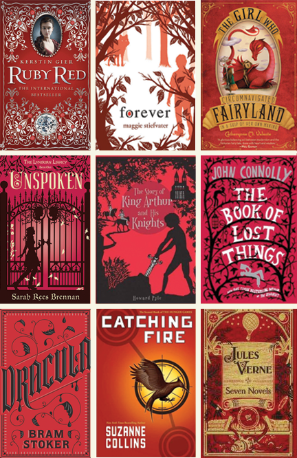
You know me! I love colors, I love art, and I love beautiful book covers. So this new feature here on my blog features my favorite covers from every color of the spectrum. I’ll also feature a short explanation of the color’s meaning so we can discuss if the predominate use of that color was a good choice.


In honor of Halloween coming up, this time I chose to feature covers that are predominately orange. Orange combines the energy of red and the happiness of yellow. It is associated with joy, sunshine, and the tropics. Orange represents enthusiasm, fascination, happiness, creativity, determination, attraction, success, encouragement, and stimulation.

So, what do you think? Does orange work for these covers? Have you read any of these? What orange covers am I missing?


Covers of the Rainbow: Red

Posted September 26, 2012 by Jana in Cover Talk, Covers of the Rainbow / 6 Comments


You know me! I love colors, I love art, and I love beautiful book covers. So this new feature here on my blog features my favorite covers from every color of the spectrum. I’ll also feature a short explanation of the color’s meaning so we can discuss if the predominate use of that color was a good choice.


This time, I’m featuring red covers. Red is the color of fire and blood, so it is associated with energy, war, danger, strength, power, determination as well as passion, desire, and love.

So, what do you think? If you’ve read these books, does the use of red on the cover reflect the subject matter of the story? What other red covers do you like?


Again… That’s Totally the Same cover! (#3)

Posted August 30, 2012 by Jana in Cover Talk / 7 Comments

It’s been a while since I showed off some copycat covers, so I thought it’d be fun to write another post! I’ve gotten a lot of comments on my other posts about how stock images are cheaper than hiring a photographer for your own photo shoot, etc. I know! I promise I know this. :) I’m not pointing fingers or trying to stir up trouble. I just enjoy finding duplicates out there in the book world. :) It’s all in good fun!

Blue Skies by Catherine Anderson (Portuguese version)
Cicada by Belle Whittington

I definitely like the treatment of the image better on Catherine Anderson’s book than I do on Belle’s. Plus, I like the typography so much more. It’s not that I don’t like the second one, I just like the entire presentation of the first one more than the second.

Luna by Julie Anne Peters
Fate by Jennifer Lynn Barnes

I like the colors on the second one more than the first. It’s so bright and colorful. The butterfly is more of a focal point, plus I like the way the title was tattooed to the girl’s arm.

Flirting with Boys by Hailey Abbott

The Secret Life of Prince Charming by Deb Caletti 
 

I like the first one more because I really dislike the big yellow box on the second one. I also enjoy it when the title has equal or more emphasis than the author’s name. “Deb Caletti” is screaming at me so much more than the title of the book. I guess that works when you’re a really well-known author, but still… The hierarchy is better on the first one regardless. :)
So, now you get to weigh in on your thoughts! Which covers do you like better? How do you feel about multiple covers with the same imagery? Do you get mixed up between books, or do you really not care at all?


Again… that’s Totally the Same Cover! (#2)

Posted May 24, 2012 by Jana in Cover Talk, Discussion / 9 Comments

So, in March I talked about my opinion of copycat covers and showed off some of them (click here to see!). I have found more! Which do you like better? How do you feel about covers with the same images? Yes, they are stock photos… but this can be avoided if a publisher hires a photographer and copyrights the image. Of course, it costs more money, but I’d rather do that than have my book show up to a party in the same dress as someone else’s. Sometimes they both look good in the same dress… but still. I’d want my cover to be completely unique. :) What do you think?

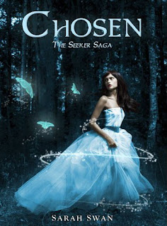
Chosen by Sarah Swan

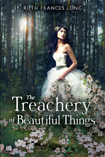
The Treachery of Beautiful Things by Ruth Frances Long
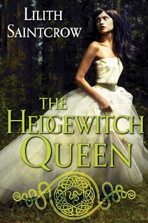
The Hedgewitch Queen by Lilith Saintgrow

The artist who did Treachery of Beautiful Things did a great job with this one! You can hardly tell! The other two are pretty similar.


Glimmerglass by Jenna Black

No, this is not the same book! We have twins here! Wow… Same fonts, same dots, same everything! To give them credit, we’re dealing with two different countries… and I seriously love this cover. But wow! Do they sell pre-made covers anywhere?


Evermore by Alyson Noel
North of Beautiful by Justina Chen Headley
Selena Penaluna by Jan Page


When Good Books Get Lost Behind Not-So-Good Covers

Posted January 20, 2012 by Jana in Cover Talk, Discussion / 16 Comments

Discussion time! You know how pretty much everyone judges a book by its cover, even though they say they don’t? I know I do. It’s really hard not to, especially since I’m an artist and expect the art to reflect the content. If a cover is bad (or lacking in good design, or design at all), I usually assume the book is so bad it’s not worth spending the money on a really great cover. Of course, this is not always the case. We’ve all been deceived by a beautiful cover before, haven’t we? (By the way, this will be the topic of my next discussion. Just you wait!) Here are some books I’ve read that ended up being good, despite the cover! It’s what’s on the inside that counts, right?
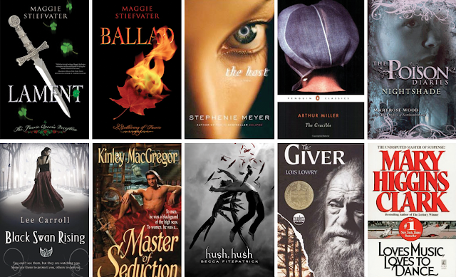
If you click on this montage, it will expand so you can see all the cover details better!

Lament: The Faerie Queen’s Deception and Ballad: A Gathering of Faerie by Maggie Stiefvater – These books are so much better than the cover! A plain black background with some clip art stuck on is no fun!

The Host by Stephenie Meyer – Yes, the silver ring in the eye is cool, but the gunky make-up in the corner of the eye is not. The story is SO long, with so much going on. I’m sure more inspiration could have been stirred up for a better cover.

The Crucible by Arthur Miller – Nothing says drama, magic, and the Salem Witch Trials better than the back of a head…

Nightshade (The Poison Diaries #2) by Maryrose Wood – There’s just too much going on here. A face with pink cotton candy stuck to it and a forest with sunbeams growing out of her chin. “The Poison Diaries” logo is well done, but then they just slapped “Nightshade” on there all non-typographically pleasing. I bet they could have incorporated it somehow.

Black Swan Rising by Lee Carroll – Ugh. I’ve read this, and there is nothing in the story that looks like this.

Most Historical Romance (Like Master of Seduction by Kinley MacGregor) – I think more people would read historical romance (and romance in general) if we didn’t have half-dressed Fabios staring at us! I love this genre, but please. We’ve got a naked man, a flowery font, and “Master of Seduction” HUGE with an innuendo of a catch phrase on there. Thank goodness I have a Kindle. Covers like these embarrass me, and I’m terrified of being seen reading a book with one!

Hush, Hush be Becca Fitzpatrick – Honestly, this dude looks like he is being murdered with a feather (the red feathers above don’t help much). Yes, he is falling from Heaven, but that pose is just unnatural and painful looking.

The Giver by Lois Lowry – Hello, old man. Yes, it works with the story, but there’s no ingenuity at work here!

Loves Music, Loves to Dance by Mary Higgins Clark – Guess who wrote this one? I hope you can read it, seeing as how the name is so small. WHY must an author’s name take up 2/3rds of a cover? It’s not like it’s a really cool name, or a really cool font. Seriously.

Ok! So, you’ve got my picks! What are yours? What other books out there have I been avoiding for years because of the cover? Or do you like these covers? Tell me what you think!