Top Ten Tuesday is hosted over at the other blog I write for, The Broke and the Bookish.
I’m a firm believer in the power of an awesome book cover. While we all wish we could place ourselves in the category of those who do not judge books by their covers, we all do it. It might not make us decide whether or not to read a book, but it almost always creates a feeling within that you expect the novel to have. Sometimes this just does not happen. And sometimes… it’s just ugly. Here are the top ten book covers I wish I could redesign.

Vampire Academy by Richelle Meade
She just has this really weird look one her face… and the shadow over her other eye is just weird. *shrug*

Don’t Turn Around by Michelle Gagnon
It’s just creepy. And the hand looks weird.

It’s not just this one. I want to redesign all book covers that are just a pretty face and nothing else. Where is the creativity?

It looks like it’s trying to be Divergent.

Phoenix Overture by Jodi Meadows
I really, really wish the designers had not decided to give Sam a face. I liked dreaming him up in my own mind, and he looks nothing like this guy. It kind of ruined it for me, and I have been lacking the motivation to read it.

The Fault in Our Stars by John Green
Will someone please tell me why this cover is a good one? It’s boring, and I don’t like how Jodi’s quote is meant to be a part of the design along with John’s prestige-ness.

Delirium Stories by Lauren Oliver
It looks like a bunch of clip art flowers haphazardly stuck together. Not good.

Sloppy Firsts by Megan McCafferty
The focus is on the legs. Why? I hear so many amazing things bout this series, that the cover of the first one should probably be nice.
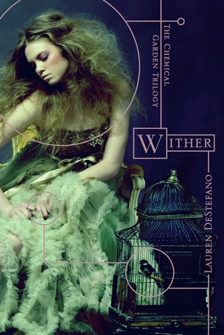
I really like the typography, but the girl looks creepy and the dress is really ugly.

This cover is just not attractive, and I’m not a fan of the font.
So, how do you feel about these covers? Agree? Disagree? Which ones did you pick?


